


/global/header/smart-buildings.svg)


/global/header/facility-management.svg)






/global/header/leisure.svg)






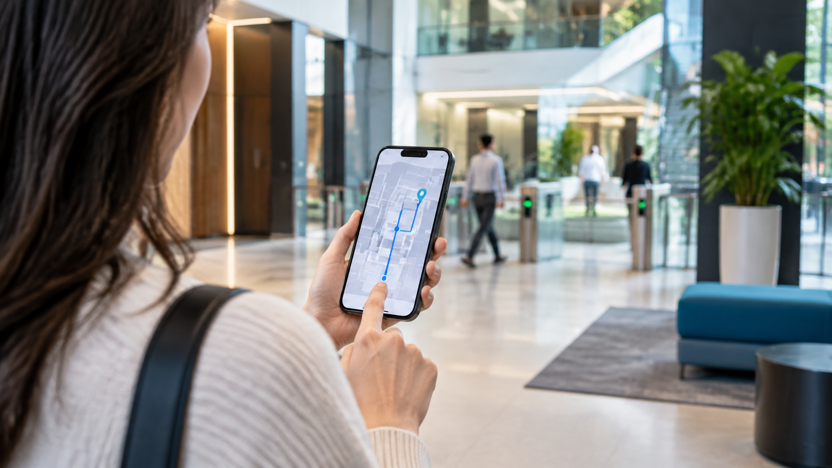
Wayfinding software gives visitors digital indoor maps and turn-by-turn routes through a mall, airport or campus. Vemco Group adds the measurement side: VemMaps places Vemcount people counting data on 3D maps from our partner Mappedin, so the operator also sees how people actually move through the building.
Most wayfinding projects are judged on downloads and taps. A kiosk or app logs which route was requested; it does not log whether the visitor arrived, which is why these projects rarely survive a budget review that asks for commercial proof. The fix is not a better kiosk. It is treating the map as the shared surface for two things that are usually bought separately: the directions you give visitors and the measurement of where visitors really go.
What a wayfinding app can and cannot tell you
Wayfinding software produces three kinds of data on its own: search terms, selected destinations and, if indoor positioning is enabled, the routes of people who opened the app and allowed location access. The first two describe intent. The third describes behaviour, but only for a thin and self-selected slice of visitors. In practice that slice skews toward first-time visitors, people looking for toilets or parking, and anyone already lost. Regulars who know the building never open the app, and regulars are usually the majority of footfall.
So when a wayfinding vendor shows a heatmap built from app sessions, ask what share of total traffic it represents. In most centres the honest answer is a small minority of visitors. Decisions about tenant mix, anchor relocation or a food court extension cannot rest on that sample.
Sensor-based counting measures everyone who passes a line or enters a zone, regardless of phone, app or consent prompt, and does so anonymously. The two sources answer different questions, and the useful thing is to put them on the same floorplan.
Indoor mapping as the common layer
Most operators evaluating analytics already have an indoor map. It was drawn for the directory, the app or the leasing plan. Rebuilding that geometry inside an analytics tool is wasted money and, worse, creates two versions of the building that drift apart every time a unit is split or a corridor is reconfigured.
This is why Vemco integrates with Mappedin as an indoor mapping partner. An existing Mappedin map can carry Vemco traffic, dwell and occupancy data directly, so the floorplan visitors see for directions is the same floorplan the operations team reads for performance. One geometry, two audiences.
Where there is no suitable map, or where the team wants a view built purely for analysis, VemMaps shows the same location data in multi-layer views by floor and zone, with export and alerts. The point either way is the same: traffic and occupancy become something you look at on a plan rather than scroll through in a table.
The measurements that change leasing and layout decisions
Counting tells you how many. Movement analytics tells you where, how long and in what order. VemTrack adds that layer on top of counting, and the outputs that mall and retail teams actually use are specific:
- Zone-to-zone flow. What proportion of people who enter from the car park reach the upper food court, and where the rest peel off. This is the direct answer to the leasing team's question: did the people who asked for a route actually arrive?
- Dwell time by zone. A corridor with high counts and eight-second dwell is a transit route; one with lower counts and ninety-second dwell is a destination. They should not be priced the same.
- Path and funnel analysis. Define the route a wayfinding signpost or kiosk is meant to produce, then measure how many people complete each step of it.
- Heatmaps. Useful for spotting dead ends and over-crowded pinch points around escalators and entrances.
- Queue detection and alerts. Relevant for tenants with service counters, and for operators measuring whether a redesigned entrance actually relieved congestion.
All of this is shown directly on the floorplan, which is what makes it compatible with indoor wayfinding rather than parallel to it. The journey analytics rely on anonymous AI re-identification within the sensor network, not on a phone identifier, so the coverage question above disappears.
Closing the loop: did the directions work?
Once movement is measured on the same map, wayfinding becomes testable. Change the default route a kiosk suggests to a new tenant on level two and watch the level-one-to-level-two flow for that corridor over the following weeks. Move a directory totem and see whether dwell at the old location collapses and the new one picks it up. Put a temporary pop-up at the end of a weak corridor and check whether the funnel completion rate for that arm of the building moves.
None of this requires visitors to do anything. It also gives property teams something they almost never have in a tenant negotiation: a before-and-after on how a layout or signage change shifted traffic to a specific unit. For shopping centres, see what visitor routes tell you about layout in our mall wayfinding guide.
An implementation detail that decides whether the numbers reconcile
Here is the thing anyone who has installed this twice will tell you. The zones drawn on the map and the zones configured in the sensor system must be the same polygons, agreed before the first device goes on the ceiling. If the wayfinding team defines the food court as the seating area and the analytics team defines it as seating plus the service corridor, the dwell and occupancy numbers will never match the map, and the first executive who notices will stop trusting both. Name the zones once, give them identifiers that survive a tenant churn, and keep one owner for the geometry.
The same discipline applies to accuracy expectations. Counting at a sensor line is contractually guaranteed at a minimum of 96% and typically lands between 98% and 99% where lighting, layout and visitor behaviour allow. That precision holds at entrances and zone boundaries. Flow percentages between zones are derived from those counts and should be read as trends and ratios, not as a decimal-point audit of every visitor. Vendors who promise a flat 99% everywhere, including on open atrium floors, are telling you what you want to hear.
What to put in the RFP
If you are scoring platforms, these questions separate wayfinding software that merely draws a map from a platform that measures the building:
- Can sensor-based traffic, dwell and occupancy be displayed on the map we already use, or must it be rebuilt?
- Does movement analysis cover all visitors anonymously, or only app users who opted in?
- Can we define a route and measure funnel completion along it?
- Are zone definitions shared between the map and the sensor configuration, with one source of truth?
- Can alerts fire on occupancy or queue thresholds per zone, and can the data be exported to the BI tools the leasing and operations teams already use?
A wayfinding app that scores well on visitor convenience but cannot answer these is a signage product. That may be all you need. But if the budget is being justified on tenant performance or layout optimisation, the measurement layer is not optional.
Frequently asked questions
What should wayfinding software measure? Beyond search terms and selected destinations, it should show whether people actually reached the places it directed them to, how long they stayed and which zones they passed through on the way. That requires anonymous sensor-based traffic, dwell and flow data displayed on the same indoor map used for directions, covering all visitors rather than only app users. Without that layer you can measure demand for directions but not the outcome.
If you already have an indoor map and want to see what traffic, dwell and zone-to-zone flow would look like on it, contact Vemco Group and bring your floorplan. We will walk through how VemTrack and VemMaps data would sit on your existing geometry and what the first ninety days of measurement should answer for your leasing and operations teams.