

/global/header/smart-buildings.svg)


/global/header/facility-management.svg)






/global/header/leisure.svg)






It is 06:40 on a Tuesday. The security lane has backed up past the roped area and into the check-in hall. The overhead display still says "Gates B, 8 minutes". The duty manager is looking at a queue camera, the signage team is looking at a content schedule, and the person responsible for the terminal map is not in yet. Three people, three screens, one problem, and nobody can say whether the backlog is a staffing issue or a wayfinding issue, because the data that would answer that question lives in three different systems.
That is the practical case for putting airport wayfinding and passenger flow on the same map. Not because a single dashboard is tidier, but because the decisions you make at 06:40 depend on seeing where people are, where they are trying to go, and where the building is making that harder than it should be.
Why wayfinding and flow are still measured apart
Most terminals measure wayfinding by proxy. Information-desk enquiries, missed-gate reports, complaints, the occasional intercept survey. Flow is measured separately: throughput at security, gate boarding times, perhaps a few door counters feeding a spreadsheet. The two sets of numbers rarely share a coordinate system, so when an ops director asks "did the new signage at the pier junction do anything", the honest answer is usually a shrug.
The gap matters more than it used to. Indoor navigation apps and digital signage have raised expectations about how quickly passengers can be moved, but the physical building has not changed. If the map on a passenger's phone says one thing and the corridor says another, the result shows up as people standing still at a junction. That standing still is measurable, if the measurement is placed in the right spot.
Count decision points, not just doors
Here is the observation that anyone who has installed sensors in a terminal will recognise. Entrances tell you how many people arrived. They tell you nothing about airport wayfinding. The useful counts come from the places where a passenger has to choose: the split after security, the junction where the pier branches, the top of the escalator where the gate numbering restarts, the point where retail opens up on both sides and the directional signage disappears behind a storefront.
Bidirectional counting at those points gives you a reversal rate. If a meaningful share of people who pass a junction heading towards Pier B come back through it in the opposite direction within a couple of minutes, the signage at that junction is not working, whatever the design review said. No survey will find that for you. A pair of sensors facing each other across the corridor will, every day, for every flight bank.
- Post-security split: the first and most consequential decision passengers make airside.
- Vertical transitions: escalators and lifts where floor numbering and gate letters often change at once.
- Retail walk-throughs: where the direction of travel is deliberately bent and sightlines to gate signage are lost.
- Gate-area entrances: where dwell before the hold room reveals passengers checking they are in the right place.
Use the map you already have
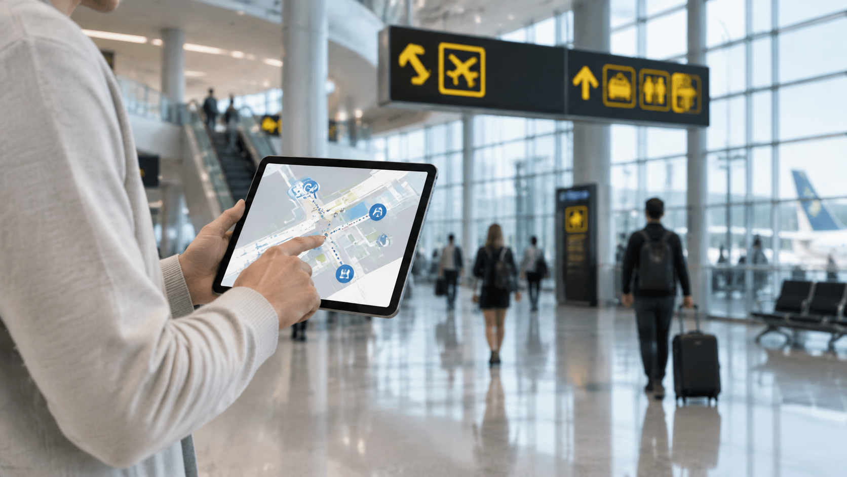
A common objection at budget stage is that the airport has already paid for an indoor wayfinding map, and nobody wants to maintain a second one just to display counts. That is a fair objection, and it is why Vemco integrates with Mappedin. If your terminal map is built there, Vemco traffic, dwell and occupancy data can be placed on it rather than on a parallel floorplan that drifts out of sync the first time a gate is renumbered. One map, one set of zone boundaries, one source of truth for both the passenger-facing layer and the operational layer.
For teams without an existing map, or for the airside areas that passengers never see on a phone, VemMaps displays location data directly on floorplans with multi-layer views. In practice that means a terminal manager can switch between a footfall layer, an occupancy layer and an alerts layer for the same floor, read a pier or a hold room as a zone rather than a row in a table, and export the view when the airline or the regulator asks for it.
From counts to movement: what changes on the screen
Counting gives you volume by zone and by time. Movement analytics adds direction and duration, which is where airport wayfinding questions actually get answered. VemTrack sits on top of counting and shows, on the floorplan, where people slow down, which zone they go to next, how long they stay, and whether a queue has formed that nobody has yet noticed.
Consider the morning scenario again. With heatmaps, dwell time and zone-to-zone flow on the same map as the security queue, the duty manager can see whether the backlog is caused by arrivals exceeding lane capacity, or by people milling in front of the lanes because the fast-track entrance is poorly marked. The first is a staffing call. The second is a signage call that costs almost nothing to fix. Without the movement layer, both look identical: a long line.
Queue detection with alerts makes this routine rather than heroic. A threshold on dwell in the pre-security zone, a threshold on occupancy in a hold room, a threshold on counter-flow at the pier junction. Each one lands on the operations desk as a map notification rather than a phone call from a frustrated airline station manager.
What to put in the business case
Directors who have read the generic articles already know the arguments about passenger experience. The arguments that survive a finance review are narrower:
- Signage spend with evidence. Reversal rates and dwell at junctions before and after a change, on the same map, instead of a design consultant's opinion.
- Fewer late passengers at the gate. Zone-to-zone timing from security to gate area, by pier, by hour, shows where the walk is longer than the display claims.
- Occupancy for compliance and capacity. Hold-room and corridor occupancy by zone, read live and exported for the record.
- One platform across the estate. Cloud infrastructure that handles a single landside shop or a full terminal, so a pilot on one pier does not require re-procurement to extend.
On accuracy, be precise in the tender rather than impressed by the brochure. Vemco's contractual minimum is 96%, and installations typically run at 98 to 99% where lighting, layout and passenger behaviour allow. Terminals with heavy glazing, low winter sun across a junction, or trolleys and wheelchairs in the counting line will sit closer to the floor of that range at specific points. Ask for the number per sensor location, not a single figure for the site.
Landside counts the same way
Passenger flow does not start at the terminal door. Forecourts, bus stands and rail links are where many arrival-time problems originate, and they are usually the least instrumented part of the estate. Weather-resistant outdoor sensors covering up to 20 metres can count the forecourt and the walkway from the car park on the same platform as the airside piers, so the map runs from kerb to gate rather than starting at the revolving door. For public-sector facility managers responsible for the surrounding transport hub, that also closes the gap between the airport's data and the municipality's.
Frequently asked questions
How is airport wayfinding measured? Directly, by placing bidirectional counting and anonymous movement analytics at decision points such as the post-security split, escalators and pier junctions, then reading dwell, reversal and zone-to-zone timing on the terminal floorplan. Indirectly, by tracking information-desk enquiries and missed gates, which lag the real problem by hours. The direct method shows whether a signage change moved people faster, the same day it was installed.
Does this replace the indoor navigation app? No. The passenger-facing map and the operational map should be the same map, which is why an integration such as Mappedin matters, but the app guides individuals while the analytics layer tells the terminal team where the building itself is causing hesitation.
Is the movement data anonymous? Yes. VemTrack produces heatmaps, dwell time, flow and queue detection without identifying individuals, which is the basis on which it can be deployed in public transport environments.
If you want to see how your existing terminal map could carry live passenger flow, dwell and occupancy by zone, or you are scoping sensor positions for a pier where the signage keeps getting blamed, talk to Vemco Group about airport wayfinding on one map.