

/global/header/smart-buildings.svg)


/global/header/facility-management.svg)






/global/header/leisure.svg)






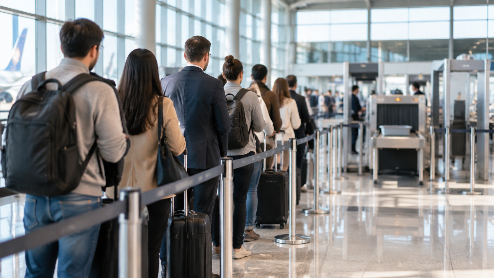
It is 06:40 at the central security checkpoint. The operations dashboard shows an average wait of nine minutes for the hour. A passenger who has just cleared the lane posts a photo of the queue with the caption "25 minutes, again". Both numbers are honest. The dashboard averaged a quiet 06:00 with a brutal 06:30, and it started the clock at the boarding pass reader, not at the back of the line that had curled past the pharmacy. This is the credibility problem with queue time in a nutshell: the figure is rarely wrong, but it is often measured from the wrong place, over the wrong period, and summarised in a way that nobody standing in the queue would recognise.
Where the argument about queue time actually starts
Before choosing a sensor or a queue management system, four definitions have to be written down and agreed with whoever will challenge the numbers, whether that is the regulator, the airline committee, a ground handler or your own board.
- Start point. Is the queue measured from the first stanchion, from where the tail actually ends, or from a fixed line painted on the floor? On peak mornings the difference can be several minutes.
- End point. Boarding pass scan, divest table, or the far side of the body scanner? Reconciliation after screening is usually excluded, but say so.
- Who counts as waiting. Staff crossing the zone, meeters standing at the edge, a passenger who steps out for a coffee and rejoins. Each needs a rule.
- Time bin. Hourly averages hide the peaks that generate complaints. Fifteen-minute bins are the practical minimum for a checkpoint; five minutes is better for alerting.
Publish these definitions alongside every report. A number without its definition is an invitation to argue.
Four ways to measure, and what each one really tells you
Manual sampling. A supervisor hands a card to the last person in line and collects it at the scanner. Cheap, defensible for a one-off audit, useless for continuous reporting. Sampling also tends to happen when someone remembers, which is rarely at 06:30.
Transaction timestamps. The gap between a pre-screening boarding pass read and a post-screening read gives a precise per-passenger figure, but only between those two points. It cannot see the tail of the queue before the first reader, which is exactly where the 06:40 complaint came from.
Device re-identification. Wi-Fi or Bluetooth probes time a phone between two antennas. The sample is biased towards whoever has a discoverable device, randomised MAC addresses have cut detection rates, and privacy officers in public sector facilities increasingly ask hard questions about it.
Zone-based queue counting. Overhead sensors count people entering and leaving a defined queue zone and record how long each anonymous track spends inside it. This gives two independent measures at once: the number of people in the queue right now, and the throughput rate at the front. Divide the first by the second and you have expected queue time, which is Little's Law applied to a checkpoint. Because the result comes from everyone who walks through, not a self-selected sample, it holds up far better in front of an audience that wants to pick it apart.
The observation most implementers learn the hard way
The queue zone you draw on the floorplan in the project phase is drawn on a normal Tuesday. The tail of a real queue is not static. At peak it snakes back past the retail frontage; off-peak it barely fills the first switchback. A fixed polygon therefore undercounts at precisely the moment the figure matters. Two practical fixes: draw a wider zone and a core zone, reporting dwell from whichever the tail currently reaches, and set a rule that the zone is reviewed whenever the stanchion layout changes. That second rule sounds trivial until a night cleaning crew moves the tensa barriers and your weekly report is quietly wrong for six days. Good practice is to export the floorplan overlay with the report so a reviewer can see exactly which square metres the numbers refer to.
Reporting that survives the first difficult meeting
Most service level frameworks for airports are already written in percentile form, for example "90% of passengers through security in under ten minutes". Report in the same shape. An average of nine minutes and a 90th percentile of 22 minutes describe the same hour, and only the second one explains the photo. Alongside the percentile, show:
- Share of passengers under the target threshold, per 15-minute bin
- Maximum queue length in people, not just minutes, because resourcing decisions are made in lanes and heads
- Throughput per open lane, so the discussion moves from "the queue was long" to "we had three lanes open against demand for five"
- The counting method, zone definition and stated accuracy, printed on the report rather than kept in a project folder
On accuracy, be plain about it. Sensor-based counting that Vemco deploys is contracted to a minimum of 96% and typically runs at 98 to 99% when lighting, layout and passenger behaviour allow. Stating that band, rather than a flat guarantee, is what lets you defend the number when someone challenges it. It also means you can say with a straight face that a reported 21-minute wait might be 20 or 22, but it was certainly not nine.
From a credible number to an earlier decision
Measurement that only produces a monthly report has paid for half of its value. The same zone counts that feed the report can trigger alerts: when occupancy in the queue zone crosses a threshold, or dwell exceeds a set number of minutes, the duty manager gets a notification rather than discovering it on social media. In VemTrack, queue detection and alerts sit on the same floorplan view as dwell time and zone-to-zone flow, so the person opening a lane can see at a glance whether the pressure is coming from the landside entrance, a bus bay or a late-arriving coach party. Watching passenger flow at the terminal doors twenty minutes upstream of the checkpoint turns the queue figure from a lagging indicator into an early warning.
For transport hubs and public buildings beyond airports, the logic is identical: a benefits office reception, a ferry check-in, a passport counter at a rail terminal. Anywhere people stand in line and someone is accountable for how long, the sequence is the same. Define the queue, count it continuously rather than sample it, report percentiles with the method attached, and connect the live count to a decision someone can take in the next ten minutes.
Frequently asked questions
How is queue time measured? The most defensible method is zone-based queue counting: overhead sensors anonymously track how many people are inside a defined queue area and how long each person stays, while also recording throughput at the exit. Queue time can then be reported either as measured dwell per person or as queue length divided by service rate. Alternatives such as manual sampling, boarding pass timestamps and phone detection each miss part of the queue or part of the population, which is why they are harder to defend when the figure is challenged.
If you are preparing a queue time reporting framework for a checkpoint, check-in hall or public counter and want to see how zone counting, dwell and alerts look on your own floorplan, contact Vemco Group at https://vemcogroup.com/contact-us and we will walk through your current definitions and where the measurement gaps are likely to be.