

/global/header/smart-buildings.svg)


/global/header/facility-management.svg)






/global/header/leisure.svg)






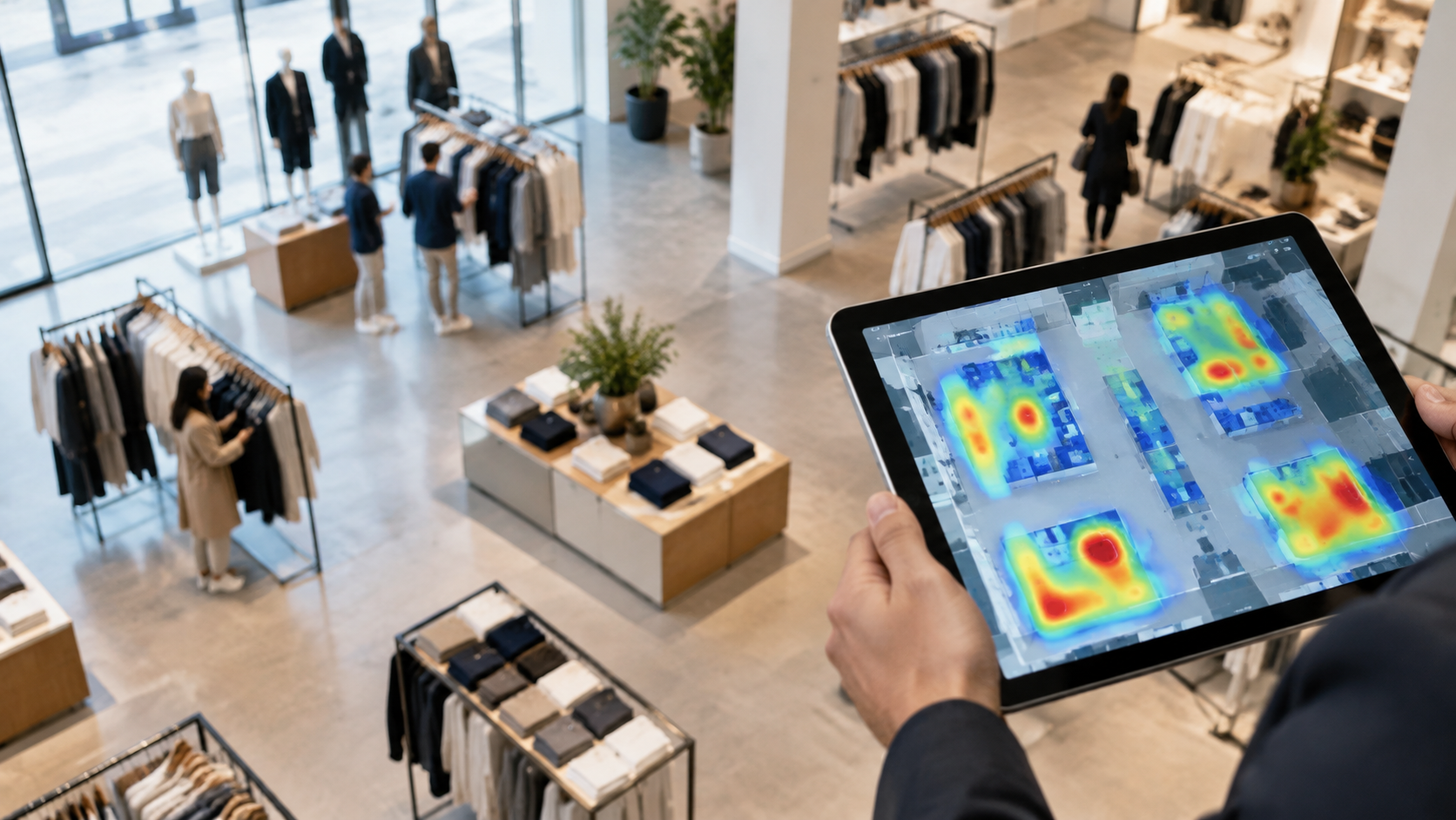
Most heat maps shown in a sales demo look impressive and tell you almost nothing. A red blob by the entrance, a cooler patch at the back, a warm strip along the promotional gondola. Any store manager could have drawn that from memory. The question a buyer should be asking is not "does it produce a heat map?" but "what decision could I make on Monday that I could not make on Friday?" If the vendor cannot answer that in the context of your floorplan, the colours are decoration.
This article sets out what to look for in heat map software for physical spaces, written for people who will have to justify the line item and then live with the result.
Start with the floorplan, not the sensor
A retail heat map is only as useful as the surface it is drawn on. Ask to see how the software handles your actual plan: fixtures, pillars, fitting rooms, the awkward L-shaped area near the stockroom door. Some tools render a heat map on a generic grid and leave you to mentally overlay the store. That is fine for a one-off study and useless for weekly operations, because nobody in a regional meeting wants to translate coordinates into "the end of the denim wall".
Three things to check here:
- Can you upload or draw your own floorplan and define zones on it yourself, without a vendor ticket?
- When you move a fixture, can you redraw the zone and keep the historical data comparable?
- Does the heat map show the same zone names your merchandising and ops teams already use?
Practitioner note: the single biggest cause of abandoned heat map projects is not sensor quality, it is zone drift. Stores change layout for a seasonal campaign, nobody updates the zone definitions, and three months later the "Promo Zone" heat map is measuring an empty aisle. Pick software where zone editing is a store-level task with an audit trail, and build a layout-change step into your visual merchandising process.
Heat is not one metric, insist on at least three
"Heat" can mean how many people passed through a spot, how long they stayed, or how many stopped at all. These are different questions with different answers. A main aisle is hot by traffic and cold by dwell. A high-ticket display may be cold by traffic and hot by dwell, which is exactly what you want. Software that collapses everything into one colour scale hides the distinction you are paying to see.
Good retail heat mapping separates:
- Traffic density: who passed where, for identifying dead zones and over-used corridors.
- Dwell time: how long people linger, for judging whether a display actually engages.
- Zone-to-zone flow: the order in which visitors move between areas, for layout and adjacency decisions.
Flow is the one most vendors skip, and it is the one that pays for the system. Knowing that 40% of people who enter Zone A go straight to the till without visiting Zone B tells you something specific about Zone B's position. A density heat map alone cannot say that. VemTrack, for example, presents heatmaps, dwell, zone-to-zone flow, path and funnel analysis on the same floorplan, so the three views can be compared for the same period instead of exported separately and stitched together in a spreadsheet.
Tie heat to the counter, or you cannot calculate anything
A heat map without a reliable visitor count is a ratio with no denominator. Dwell in the shoe zone was "high" on Saturday, compared to what? If the entrance count is off by 10%, every zone percentage you derive from it is off too, and comparisons between stores become arguments rather than evidence.
Ask the vendor what counting accuracy they will put in a contract, not what their best site achieves. Be sceptical of a flat 99% promise. A credible answer sounds like Vemco's: a contractual minimum of 96%, typically 98 to 99% where lighting, layout and visitor behaviour allow. The honest caveat is the point. Wide entrances with heavy glare, families moving in clusters and staff crossing the line all affect the figure, and a vendor who pretends otherwise has not installed in many real stores.
Once count and heat share a data model, heatmap analytics become usable in commercial reviews. Luksusbaby used VemCount to track real-time conversion and visitor demographics; adding movement data on top of that kind of base lets a category manager say "this zone attracted 18% of visitors and converted at half the store average" rather than "it felt quiet".
Privacy: anonymous by design, and provable
Movement analytics across zones requires the system to recognise that the person who left Zone A is the one who arrived in Zone B. How that is done matters legally and reputationally. Look for anonymous re-identification that works on transient visual features rather than facial recognition, no stored images of individuals, and data retention you control. Ask for the documentation your DPO will need before procurement, not after. A tool that cannot explain its own anonymisation in two pages will slow you down at the exact moment you are trying to roll out.
Alerts beat reports
Heat maps are retrospective by nature. Operations teams, though, mostly need prompts. A queue forming at the till that exceeds a threshold is more valuable as a notification to the floor manager at 14:10 than as a red patch in next week's report. Check whether the software supports queue detection with configurable alerts, whether thresholds can differ by store and daypart, and who receives them. If the answer is "head office gets a dashboard", the store will never act on it.
Multi-site comparability
For chains, the value of a retail heat map multiplies when the same zone logic applies across stores of different shapes. That requires a zone taxonomy ("Entrance", "Promo", "Fitting", "Checkout") that is independent of square metres, plus normalised metrics such as dwell per visitor or zone share of traffic. Daells Bolighus combined visitor data with in-store and online sales across its locations during a turnaround; the lesson there is that cross-site comparison only works if the underlying definitions were set centrally before the sensors went in. Retrofitting consistency across twenty stores is expensive.
A short evaluation checklist
- Heat drawn on your real floorplan, with zones you can edit yourself.
- Density, dwell and zone-to-zone flow as separate, comparable views.
- Contractual counting accuracy with stated conditions.
- Anonymous re-identification with written documentation.
- Queue alerts that reach the person on the floor.
- Central zone taxonomy for cross-store comparison.
- An export or API, so the data can meet your sales and labour data.
Run a pilot in two stores with different layouts, define three decisions you expect to make from the data, and judge the software on whether it supported those decisions, not on how the demo looked.
Frequently asked questions
What does heat map software show in a store? At minimum it shows where visitors concentrate on the floorplan over a chosen period. Better tools separate that into traffic density, dwell time and the flow between zones, so you can see not just where people were but how long they stayed and where they went next. Combined with entrance counts, this turns into zone-level engagement and conversion figures you can compare across stores.
If you are evaluating heat map software and want to see dwell, flow and queue data on your own floorplan rather than a demo store, talk to the Vemco team about a two-store pilot built around the decisions you need to make.