

/global/header/smart-buildings.svg)


/global/header/facility-management.svg)






/global/header/leisure.svg)







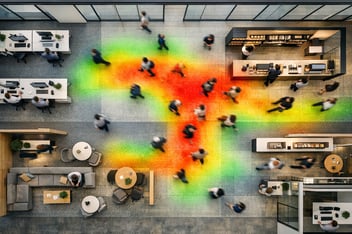
Most venue operators already own the data they need. The problem is where it lives. Footfall sits in one dashboard, tenant sales in a spreadsheet, occupancy in a facilities tool, and leasing terms in a CRM. When a decision has to be made — reallocate a tenant, re-staff a terminal, redesign a floor — someone spends half a day stitching those sources together into a slide. That stitching exercise is what 3D mapping data visualisation eliminates. Instead of reading numbers about a space, you read the space itself, with the numbers rendered directly on the floor plan where they were generated.
This is the logic behind Vemco Group's new integration with Mappedin, the same mapping platform that powers wayfinding at Amsterdam Schiphol. The integration puts Vemcount footfall and sales data, Vemspace occupancy data and Vemlease leasing data live on interactive 3D maps inside the Vemco platform — with alerts that fire in map context, not in a separate notification feed you have to cross-reference against a floor plan from memory. If visitor directions are part of your project, see our guide to wayfinding software that also measures how people move.
Why the shift to spatial context matters commercially
A table showing that Zone C underperforms Zone A by 30% is information. A 3D map showing that Zone C sits behind a dead-end corridor, next to a vacant unit, downstream of an escalator that only runs one way — that is a diagnosis. The commercial value of 3D mapping data visualisation is not prettier reporting; it is faster causal reasoning. Decision makers stop asking "what is the number?" and start asking "why is the number happening there?", which is the question that actually moves rent rolls and conversion rates.
The market has noticed. According to Growth Market Reports, the indoor mapping for venues market was valued at 6.9 billion USD in 2025 and is forecast to reach 20.9 billion USD by 2034, a 13.2% CAGR. That growth is not driven by cartography enthusiasm. It is driven by operators who have concluded that data divorced from location is data that gets ignored in meetings.
What each industry actually sees on the map
- Shopping centres: footfall and tenant sales per zone rendered on the 3D floor plan, alongside Vemlease leasing data. That combination lets asset managers argue turnover rent negotiations with evidence a tenant can see: here is your unit, here is the traffic passing it, here is what comparable zones capture. Vacant units stop being rows in a spreadsheet and become visible gaps in a flow pattern.
- Airports: passenger flow and dwell time by area, mapped against gates, security lanes and retail concessions. When a delayed bank of departures compresses dwell into one pier, operations sees it as a moving concentration on the map, not as an anomaly in yesterday's report.
- Offices: live desk and room occupancy from Vemspace, floor by floor. Workplace teams making consolidation or lease-exit decisions can defend them with visible utilisation patterns rather than badge-swipe averages that flatten out the difference between a full Tuesday and an empty Friday.
- Retail chains: zone-level comparison across stores, visually. A merchandising director can pull up two stores side by side and see why an identical planogram performs differently — often the answer is entrance geometry, not product.
- Healthcare and public buildings: occupancy and flow mapped to waiting areas, corridors and service points, which turns capacity planning and safety compliance from periodic audits into continuous observation.
Alerts in map context: the underrated feature
Every analytics platform sends alerts. Most of them arrive as text: "Occupancy threshold exceeded, Zone 4B, Level 2." The recipient then has to translate that string into a mental picture of the building — and if they are a duty manager who started last month, they cannot. Alerts rendered directly on the 3D map remove the translation step. The person on shift sees where the problem is, what surrounds it, and which route reaches it. In airports and large centres, that difference is measured in minutes of response time, and minutes are exactly what queue complaints and safety incidents are made of.
A note from implementation experience
One thing practitioners learn quickly: the map is only as trustworthy as the zone definitions behind it. The most common failure mode in these projects is not sensor accuracy — it is zones drawn to match an outdated floor plan, so the visualisation confidently displays data for a wall that was moved during last year's refit. Before any 3D rollout, budget time for a physical walk-through to reconcile sensor coverage, zone boundaries and the current floor plan. It is unglamorous work, and it is the difference between a map people trust and a map people quietly stop opening.
Data quality underneath the map matters just as much. Vemco, with 20+ years in people counting, counts more than 60 million people every day across 55,000+ installations in 98+ countries, with a contractual minimum counting accuracy of 96% — typically 98–99% in practice when lighting, layout and visitor behaviour allow. Latency runs at roughly two seconds, which is what makes "live" on the map genuinely live rather than a fifteen-minute-old snapshot dressed up as real time.
The procurement question: do you have to replace your sensors?
For most decision makers, this is the deal-breaker question, so here is the direct answer: no. The Vemco platform is sensor-agnostic and works with Xovis, Milesight, Elsys, Hikvision, Axis and Irisys hardware, among others. If you have already invested in counting or occupancy sensors, the 3D mapping layer sits on top of that estate rather than demanding a rip-and-replace. That changes the business case considerably — the cost of adding spatial visualisation to existing data is a fraction of re-instrumenting a building, and it protects the sensor CapEx your organisation has already approved and depreciated.
How to evaluate whether this is worth budget now
Three tests separate genuine value from dashboard decoration. First, count how many decisions in the last quarter required someone to manually combine location data with performance data — leasing reviews, staffing changes, layout adjustments. Each one is a candidate for the map. Second, ask whether your operational teams can currently act on an alert without consulting a floor plan; if not, map-contextual alerts have a measurable payback. Third, check whether your current tools force footfall, sales, occupancy and leasing into separate views. If they do, you are paying the stitching cost weekly, in analyst hours and in decisions delayed until the deck is ready.
3D mapping data visualisation is not a new category of data. It is a better interface to the data you already collect — one that matches how humans actually think about buildings, which is spatially, not in rows and columns. The operators who adopt it first will not have better numbers than their competitors. They will simply act on the same numbers faster, with fewer meetings in between.
Want to see your own building's footfall, sales and occupancy data on an interactive 3D map — using the sensors you already have? Book a walkthrough of the Vemco and Mappedin integration with a specialist who knows your industry at vemcogroup.com/contact-us.